Features
| Site: | Kingston College e-Campus |
| Course: | Kingston College e-Campus |
| Book: | Features |
| Printed by: | |
| Date: | Monday, 20 May 2024, 2:06 AM |
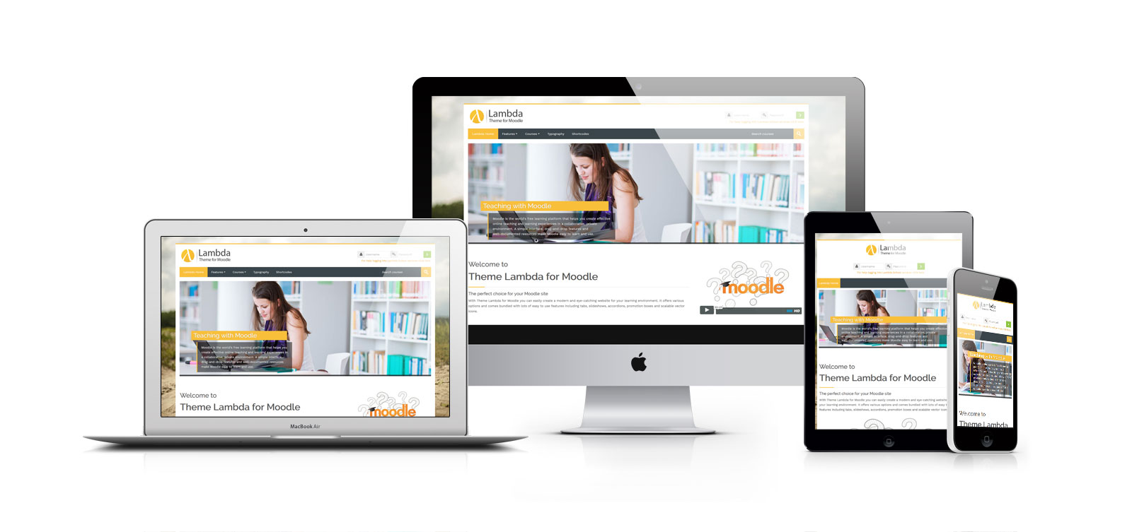
Fully Responsive
One framework, every device.
Theme Lambda uses Bootstrap, the most popular framework for responsive web design.
Bootstrap easily and efficiently scales your websites and applications with a single code base, from phones to tablets to desktops with CSS media queries.
Bootstrap Grid System
A single column
Lorem ipsum dolor sit amet, consetetur sadipscing elitr, sed diam nonumy eirmod tempor invidunt ut labore et dolore magna aliquyam erat, sed diam voluptua.
A single column
Lorem ipsum dolor sit amet, consetetur sadipscing elitr, sed diam nonumy eirmod tempor invidunt ut labore et dolore magna aliquyam erat, sed diam voluptua.
A single column
Lorem ipsum dolor sit amet, consetetur sadipscing elitr, sed diam nonumy eirmod tempor invidunt ut labore et dolore magna aliquyam erat, sed diam voluptua.
A single column
Lorem ipsum dolor sit amet, consetetur sadipscing elitr, sed diam nonumy eirmod tempor invidunt ut labore et dolore magna aliquyam erat, sed diam voluptua.
A single colored column
Lorem ipsum dolor sit amet, consetetur sadipscing elitr, sed diam nonumy eirmod tempor invidunt ut labore et dolore magna aliquyam erat, sed diam voluptua.
A single colored column
Lorem ipsum dolor sit amet, consetetur sadipscing elitr, sed diam nonumy eirmod tempor invidunt ut labore et dolore magna aliquyam erat, sed diam voluptua.
A single colored column
Lorem ipsum dolor sit amet, consetetur sadipscing elitr, sed diam nonumy eirmod tempor invidunt ut labore et dolore magna aliquyam erat, sed diam voluptua.
A single colored column
Lorem ipsum dolor sit amet, consetetur sadipscing elitr, sed diam nonumy eirmod tempor invidunt ut labore et dolore magna aliquyam erat, sed diam voluptua.
<div class="row-fluid"> <div class="span4"><h5>A single column</h5><p>lorem ipsum...</p></div> <div class="span4">...</div> <div class="span4">...</div> <div class="span4">...</div> </div><div class="row-fluid colored"> <div class="span4"><h5>A single colored column</h5><p>lorem ipsum...</p></div> <div class="span4">...</div> <div class="span4">...</div> <div class="span4">...</div> </div>
Bootstrap Components
Full of features, easy to include
Over a dozen reusable components built to provide dropdowns, input groups, carousels, alerts, and much more.
Available Bootstrap Components
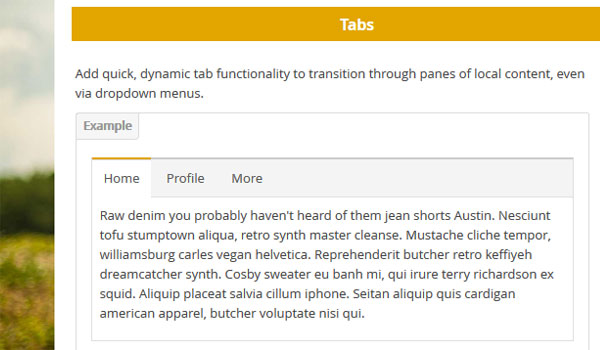
Tabs
You can use the links below to the demos of the included Bootstrap components to watch the element in action.
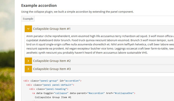
Accordion
You can use the links below to the demos of the included Bootstrap components to watch the element in action.
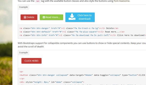
Buttons
You can use the links below to the demos of the included Bootstrap components to watch the element in action.
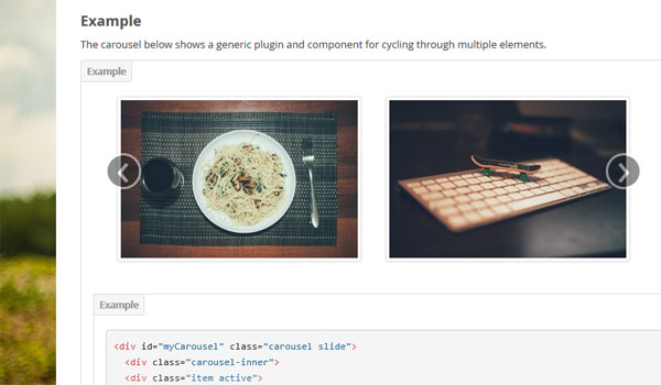
Carousel Slider
You can use the links below to the demos of the included Bootstrap components to watch the element in action.
Theme Options
Powerful Admin settings
Quick and easy customization - options for everything you need!
Theme Lambda allows you to build your own style. The control panel for the theme options is included in the Moodle administration panel. It is subdivided into different points for an otimized workflow:
Administration with Theme Lambda
Main features in the theme settings:
- Choose from included background images or upload your own
- Color Picker: unlimited color options for multiple elements
- Variable or fixed width
- Choose between boxed or full layout
- Different layouts for the block columns
- Font selector for headings and body
- Style your frontpage with Camera slider
- Carousel slider for the frontpage
Theme Lambda's UI
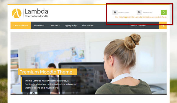
Login
Theme Lambda uses a "one-click" login area. It is directly accessible without any extra login page.
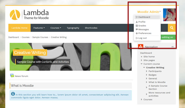
User Menu
After a successful login you can access the user menu dropdown system.
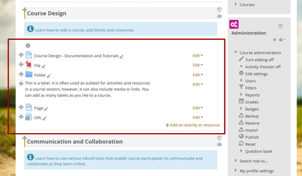
Course editing
As an administrator or course teacher you are allowed to change the appearance and functionality of a course.
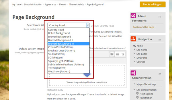
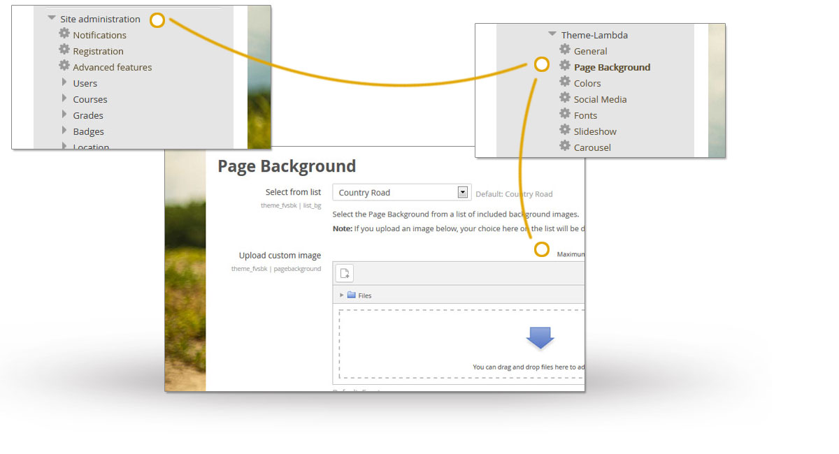
Theme Settings - background image
As an administrator, you have access to Lambda's theme options: For example Theme Lambda has different imcluded background images you can selcect from a list...
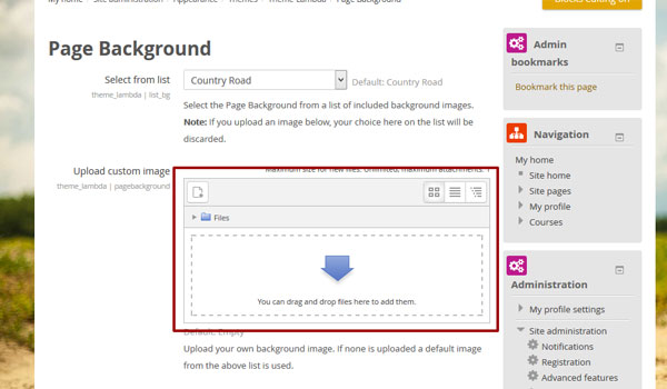
Theme Settings - upload image
... or you can upload your own image with an easy drag & drop interface.
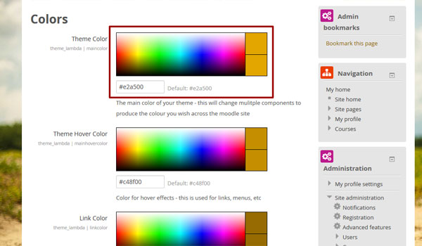
Theme Settings - custom colors
With the Moodle color picker you can click on the desired color or you can enter the color code for different elements of the theme.
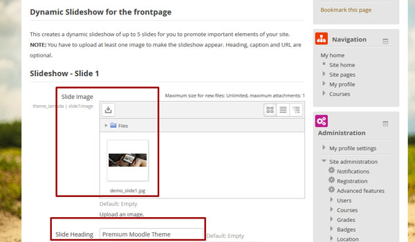
Theme Settings - frontpage slider
You don't have to enter a single line of HTML Code for the frontpage slider or the carousel: Enter headings in captions in textfield and upload images via drag & drop.
Font Awesome
One Font, 929 icons
In a single collection, Font Awesome 5 is a pictographic language of web-related actions
Font Awesome gives you scalable vector icons that can instantly be customized -- size, color, drop shadow, and anything that can be done with the power of CSS. Plus: Font Awesome won't trip up screen readers, unlike other icon fonts.
Basic Icons
fa-camera-retro
You can place Font Awesome icons just about anywhere using a CSS style prefix and the icon’s name. Font Awesome is designed to be used with inline elements (we like the <i> tag for
brevity, but using a <span> is more semantically correct).
<i class="fas fa-camera-retro"></i>
- If you change the font-size of the icon's container, the icon gets bigger. Same things goes for color, drop shadow, and anything else that gets inherited using CSS.
Icon Sizes
List Icons
- List icons can
- be used to
- replace bullets
- in lists
Bordered & Pulled Icons
Spinning Icons
Rotated & Flipped
Stacked Icons
The above examples are taken from the official Font Awesome 5 documentation.
Multilanguage
100% Multilanguage Support
Over 100 built-in language packs that can easily be enabled and plugins that provide extended multi-lingual capabilities.
Displaying text in multiple languages
The multi-language content filter enables resources to be created in multiple languages.
To use this feature first create your content in multiple languages (in the same resource). Then enclose each language block (aka multilang block) in the following tags:
      <span lang="XX" class="multilang">your_content_here</span>
      <span lang="YY" class="multilang">your_content_in_other_language_here</span>
It is essential to be in the code editing mode (press [<>] in the HTML editor), when you enter these tags for them to work. Only spaces, tabs and enters can be used between the individual languages in the multilang block.
Enabling the multi-language content filter
An admin can enable the multi-language content filter as follows:
- Go to Site administration > Plugins > Filters > Manage filters and in the dropdown menu for multi-language content select 'On'.
- If headings are to be shown in multiple languages too, select 'Content and headings' in the 'Apply to' column. Note that this may affect site performance.
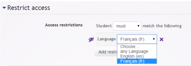
The 'Restriction by language' additional plugin
Language filters are great, but sometimes they can make your resources and activities very complex.
The Restriction by language availability condition is an additional plugin that makes it easy to show an English resource only to English users and an activity in French only to French speaking students.
Social Media
Let your users stay connected with you!
Theme Lambda makes it easy for you to place social network icons to your Moodle site.
Social Media via Theme Options
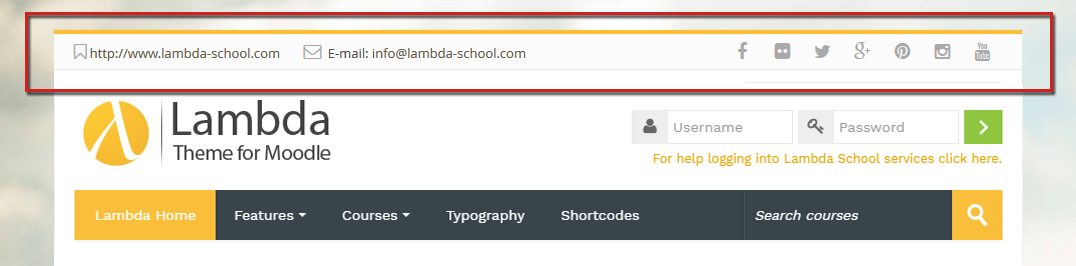
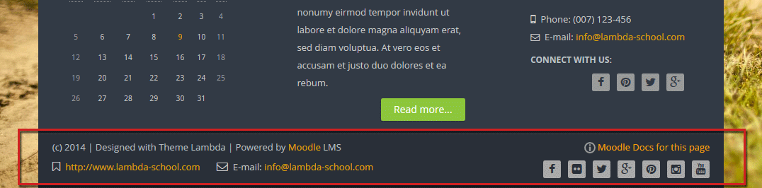
In the Theme Options you will see several textfields, one for each included social network. In those fields you should copy/paste the URL to your social network profile (i.e https://www.twitter.com/mycollege).
After entering the links you can choose where to place the social media icons: at the bottom of the page (footer) or at the top (header). You can also set up the color for the icons to fit in your site.
Social Media via HTML Block
Theme Lambda offers pre-defined shortcodes so that you can easily set up a HTML Block with your social media links.
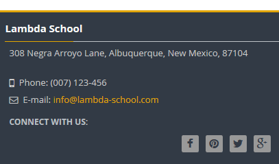
<address>308 Negra Arroyo Lane, Albuquerque, New Mexico, 87104</address>
<i class="fa fa-mobile fa-lg"></i> Phone: (007) 123-456<br>
<i class="fa fa-envelope-o"></i> E-mail: <a href="info@lambda-school.com">info@lambda-school.com</a>
<h6>Connect with us:</h6>
<div class="social_icons pull-right">
  <a class="social fa fa-facebook" target="_blank" href="https://www.facebook.com/mycollege"> </a>
  <a class="social fa fa-pinterest" target="_blank" href="http://pinterest.com/mycollege/mypinboard"> </a>
  <a class="social fa fa-twitter" target="_blank" href="https://www.twitter.com/mycollege"> </a>
  <a class="social fa fa-google-plus" target="_blank" href="https://plus.google.com/+mycollege"> </a>
</div>The advantage of using a HTML Block is that you can place it to any block position in Moodle you want, even at the footer.